Improve your skills. Recapture the joy - one element at a time!
- Home
- Space
The Element of Space
The element of space in art is mostly about creating an illusion - magic tricks to fool the eye!
Fun to work with - transforming our flat paper or canvas into a world of depth, space and distance.
You may be familiar with these tricks, but in case you need a refresher, here they are...
- Overlapping
- Placement
- Size
- Color
- Perspective
- Tone
- Detail
- Positive and Negative space
Let's start with overlapping and placement and see what Frida Kahlo does with them...
Overlapping and Placement
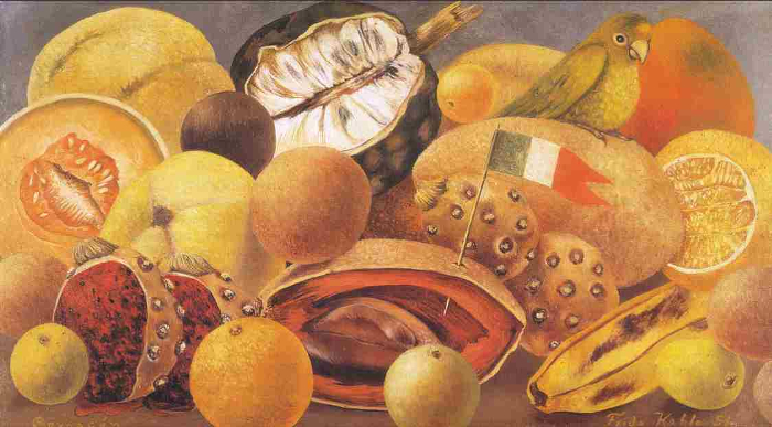 "Still life with Parrot and Flag" Frida Kahlo 1951
Kahlo wants to paint all the objects in a heap on a table. Mostly fruit, but she likes the look of a flag in there - and it was probably difficult keeping her parrot out of it anyway!
Obviously each fruit must be occupying its own space so how does she make that work?
Firstly, placement - she positions the fruits that are in front at the bottom of the canvas.
Then, overlapping - the fruits further back are partially hidden by those in front of them.
Easy! Well, you knew that, right?!
Size
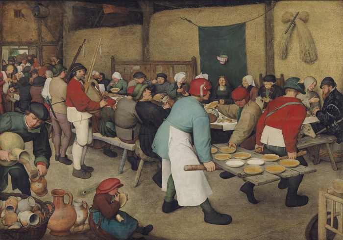 "Peasant Wedding" Pieter Bruegel the Elder 1568
So here we are having grand old time at the wedding!
A lot of people are invited so they need to hold the event in the big barn - giving us a good opportunity to see how Bruegel handles that amount of figures.
How does he do it? Well, apart from the overlapping trick (a lot) and placement trick (some) Bruegel uses size to convey the feeling of a large space containing a crowd of people.
The people nearest to us are the biggest (except for the little boy tucking into a plate of something tasty!)
As we go further back in the room the figures get progressively smaller, until right at the very back where they're squashing in to get at the food, they're smallest of all.
Works well, yes? We can almost hear all that noise going on!
(By the way, can you spot the extra foot?)
Color
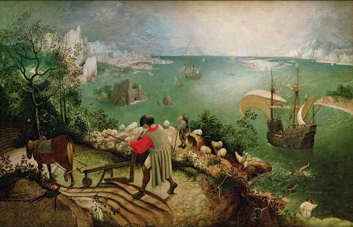 "Landscape with the Fall of Icarus" Pieter Bruegel the Elder? c.1560
It's not certain now if Bruegel painted this - experts think it could be a good early copy - but whoever it was, they did a good job of conveying the illusion of space and distance.
He's using the trick that warm colors appear to advance and cool colors recede.
There's no missing that red shirt - the hot red is certainly standing out in front of everything else.
Notice how the rest of the work is painted in progressively cooler colors? It's this use of color that helps to convey the feeling of spaciousness as we look towards the far distance.
In fact the red takes our attention so much that it's only later that we notice the rather extraordinary thing that's going on in the sea! (That's Icarus, of Greek Mythology!)
The figures in the painting seem oblivious to the drama - farmer steadily ploughing his curve, shepherd leaning on his staff, and the man on the cliff absorbed in his fishing!
But whatever has been going on, the artist's clever use of warm and cool colors certainly does the job of portraying space and distance.
More on warm and cool colors
Linear Perspective
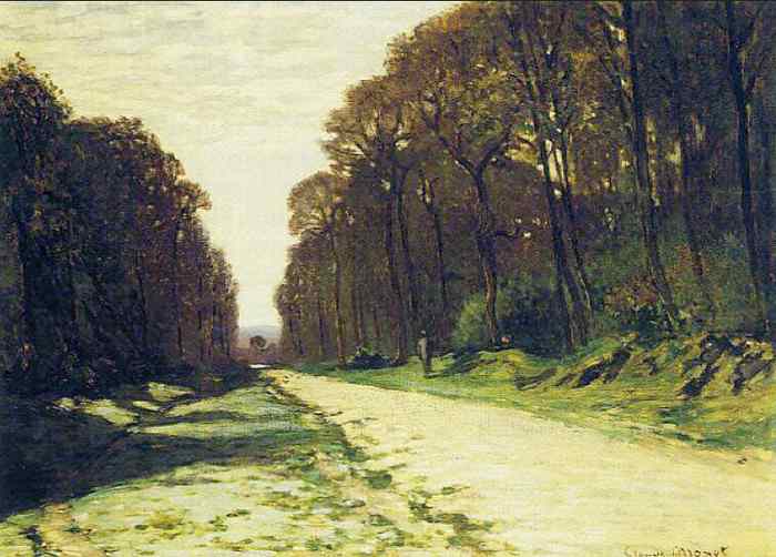 "Road in a Forest, Fontainebleau" Claude Monet 1874
Monet obviously liked this view of the forest road vanishing into the distance, with a glimpse of a river at the end.
So how does he capture this effect? Well, he does it by making parallel lines meet!
What? Parallel
lines can't meet - not possible! Ah, but this is art - we can make 'em
meet if we want and this is how to do it:
See the lines of road edge, ditch, and the line of the bank under the trees?
We know that in reality they would be more or less parallel, but they look as if they're getting narrower and smaller as they go away from us.
Eventually those 'parallel' lines will meet pictorially, somewhere in the river, at what is called the vanishing point.
The tops of the tall trees each side of the road make lines too - which also meet at the same vanishing point.
And that's how Monet does it - creating a sense of space and distance using the magic of linear one-point perspective.
Nothing to it, is there? Easy, once you see it!
Atmospheric Perspective
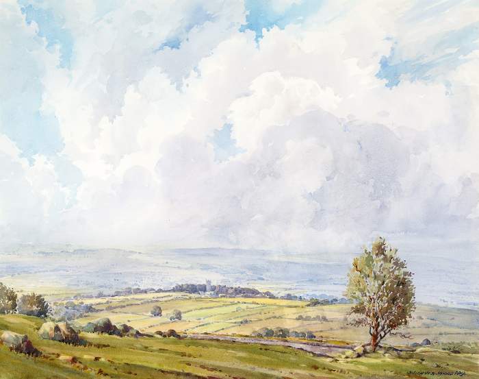 "Widecombe-in-the-Moor, Dartmoor" Josiah Moore c.1972
If you've ever looked at the landscape when out walking, you've seen atmospheric (or aerial) perspective - and in this watercolour Josiah Moore shows us three ways to portray it.
Firstly, tone (darks and lights) - his darkest tones are in the foreground and get progressively lighter towards the distance. More on Tone
Next, color - in reality color tends towards the blue end of the spectrum in the distance and that's what we see here. More on Color
Then, detail - objects near to us have more sharply defined detail. As they get further away they are less clear until in the far distance we see hardly any detail at all.
All these things we instinctively know and can be used in our work to convey space and distance.
All the techniques described above combine to make a painting filled with sun, spaciousness and fresh moorland air!
Positive and Negative Space
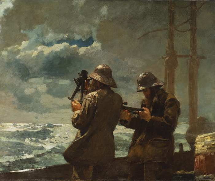 "Eight Bells" Winslow Homer 1886
Here, Winslow Homer gives us a dramatic example of positive and negative space in action.
Two sailors taking measurements make up the main positive space in the painting. Sea and sky form the background negative space. Why does Homer need both?
Well, our eyes are immediately drawn to the positive space taken up by the figures, but the treatment of the cold, stormy background plays a vital part because it provides the rest of the story and gives us a sense of distance.
We assume it's the end of the sailors' watch (eight bells) - they've been up on deck for 4 hours in the storm and will be glad to get back to the relative warmth below decks.
Homer uses size and tone tricks too, but both positive and negative space are needed to convey the whole drama - one playing the star part, the other, best supporting actor!
Spot the space elements in this soup can!
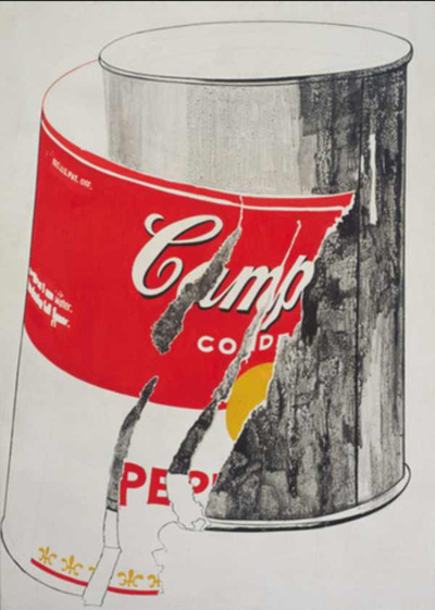 "Big Torn Campbells Soup Can" Andy Warhol 1962
Here's a totally different kind of art - one of the famous soup can images by Pop artist, Andy Warhol.
I'm seeing three space element tricks in the work - how about you?
The Element of Space in Art - Your Way!
So that's it! Eight tricks to fool the eye and give a sense of space, depth and distance to your painting or drawing.
You're probably using some of them already but maybe some are new to you. They all enrich our work, if we know what we're doing and why.
They all can be used in different kinds of two-dimensional art, not just the ones which are displayed on this page. Use them in landscape, still-life, imaginative, pop art, op art, abstracts, even portraits.
Why don't you pick one of the tricks today and, if you're feeling brave, branch out into a kind of art you haven't tried before?
If that's step too far just yet, look at some of your past work and see if it could be improved with one or more of the space tricks. Do a new one in the same style but include what you've learned on this page - you'll surprise yourself!
Good luck, fellow artists!
(By the way, the space 'tricks' Andy Warhole uses in his "Big Torn Campbells Soup Can" image are of course, overlapping, colour, and detail!)